


Weekly Forecasts 3/2025
Improving economic momentum with risks abound (Free)

China an the U.S. look to pull the world economy into growth, for a short-while at least.
Recession indicators of the U.S. continue to indicate an approaching recession.
U.S. inflation outlook continues mixed, with notable risks of a sudden re-acceleration lurking in the background.
Is global economic recovery on the horizon?
One of the main indicators of global economic momentum, we’ve been following since 2017, are the composite leading indicators published by the OECD. In mid-December, we noticed a possible turning point of the world economy approaching. Updated indices effectively confirm this. There’s a definite upward trend visible in Chinese and U.S. indicators, implying an improving economic momentum going forward. Yet, risks overshadow it.

The question which haunts us is, are the economies of Europe going to follow? The Eurocoin index, published by the Centre for Economic Policy Research of Banca D’Italia, and which we use in our nowcasting, hints that they would.

If we look at the leading indicators of the major nations of Europe separately, we notice that there’s a noticeable lift-off ongoing in the economies of France, Italy and Spain. Germany can be considered as the ‘great outlier’, this time around. Her economy appears to keep sinking.

These are positive signs for the Eurozone and Europe. However, due to major uncertainties relating to the German economy and European energy security (Ukraine + the Middle East), and continuing issues with the U.S. banking sector, we do not alter our European nor global recession warning, yet. This is because, while we are currently expecting the global economic momentum to improve during the next few months, the risk of recovery-derailing shocks continues to be high.
U.S. recession outlook
We have been tracking the U.S. recession indicators since May. Tuomas announced a credit recession on April 11, and we monitored the situation throughout the year. We continue this now by updating two recession forecasting metrics. The first ones are the yield curves of 10y/2y and 10y/3mo U.S. Treasuries.

Both have now un-inverted.For reasons we explained in September, we currently trust more on the 10y/2y yield curve. In 1989-1990, it took nine months from the un-inversion of 10y/2y yield-curve for the recession to arrive. In 2000-2001, it took three months and in 2007 about six months. It has now been approximately four and half months since the un-inversion of the 10y/2y yield curve (at the end of August). So, based on the historical record, U.S. recession should start within the next five months.
The another metric, the private sector yield curve, measures the difference between the long-term corporate bond yields and the bank prime rate.1 Tuomas explained its role in May:
Effectively, the private sector YC measures the difference between the rates which SMEs and large corporations borrow. When it inverts, it signals that SMEs are paying more for their bank loans than big corporations are paying for their loans acquired through the capital markets. This implies that banks are tightening their lending standards and/or that the central bank is rising interest rates, which lead SMEs to cut back their borrowing and thus consumption, pushing the economy into a recession.
While it’s track record is not impeccable, at current times with QEs and QTs running amok in the government bond universe, private sector yield curve is likely to be less biased than the traditional yield curves, which rely on data on Treasuries, the main assets the Fed buys/sells. This is what it is showing us currently.
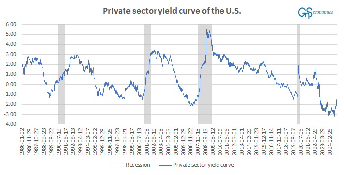
The two ‘false positives’ during the 1990s, when the curve un-inverted, but there was no recession, cast some doubt on the reliability of the private sector yield curve in recession prediction. Currently, the curve looks to be in a process of un-inverting, which can signal an onset of a recession, á la 2001, 2008 and 2020. In all of those times, the un-inversion was caused by rapidly dropping bank prime rate, when the bond yields stayed (more or less) constant or increased, the latter indicating a falling demand (prices) for corporate debt. The decline of bank prime rate signals falling demand for bank loans and/or that the Fed is cutting rates. Rising bond yields indicate growing risk aversion among investors. Both are thus recessionary signals (indicating declining economic momentum).
From the cycle-peak of 8.5%, bank rates had dropped to 7.75% by December 23 (the latest bank rate data available). This was a rather miniscule drop, while bond yields did not budge. However, when we look the latest data on bond yields, we notice a quite notable uptick occurring at the beginning of the year.

If this trend would continue with the bank rates heading lower, the private sector yield curve would start to signal slowing economic momentum and growing uncertainty towards corporate risk, triggering a recession warning. We keep monitoring this metric.
U.S. inflation outlook
December inflation data was published on Wednesday. Let’s delve right in.
The headline Consumer Price Index (CPI) came at 2.9% (annualized), which was as expected. This was an acceleration from November, when the Y-o-Y rate of change was 2.7% and it continues the trend of accelerating inflation since September. The core-CPI, stripping out food and energy, grew by 3.2%, which was less than expected (3.3%) and below the 3.3% rate of November. The ‘super-core’ inflation rose at the pace of 4.4%, which was below the 4.6% rate in November. The monthly rate of change of CPI accelerated (from 0.3 to 0.4%), but decelerated with core and super-core. All in all, this report was a mixed bag, but with some positive signs.
There’s few developments relating to this we want to report. The M2 money aggregate of the U.S. economy has resumed its growth.2
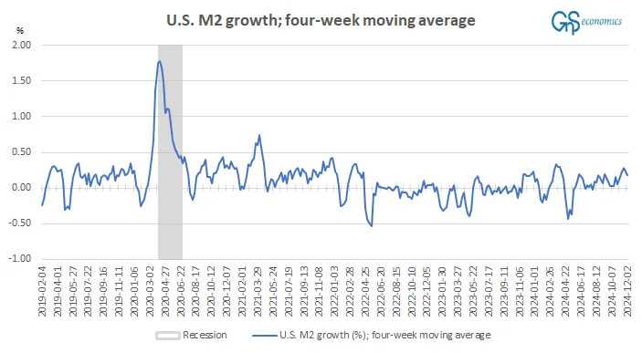
While miniscule, the “broad” money supply of the U.S. is has grown despite of the Federal Reserve shrinking its balance sheet, through quantitative tightening (QT). QT affects the cash balances in U.S. banks.3 When the Fed buys assets (in QE), balances tend to grow, while the opposite happens, when it sells (QT).
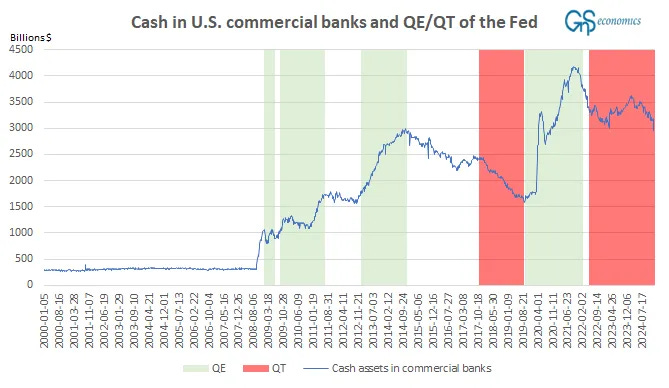
The jump in the cash assets during 2023 was due to the banking crisis and the different support measures enacted by the Fed (most notably the BTFP). The series tells us that there’s still a lot of “cash-like” items affecting the U.S. monetary supply.
The point we are making here is that, because of the growth in the U.S. monetary base (M2) and because of the vast amounts of ‘cash’ still sloshing around the U.S. economy, inflation can pick up suddenly. All that would be needed, would be an acceleration in economic activity which, according to our first forecasts of the week, would be coming. Just imagine what would happen, if this (the velocity of money in the U.S.) would start to increase (normalize).

The other shock can come from the Middle East, like we’ve been warning. We return to this risk in more detail in the coming weeks.
Disclaimer:
The information contained herein is current as at the date of this entry. The information presented here is considered reliable, but its accuracy is not guaranteed. Changes may occur in the circumstances after the date of this entry and the information contained in this post may not hold true in the future.
No information contained in this entry should be construed as investment advice. GnS Economics nor Tuomas Malinen cannot be held responsible for errors or omissions in the data presented. Readers should always consult their own personal financial or investment advisor before making any investment decision, and readers using this post do so solely at their own risk.
Readers must make an independent assessment of the risks involved and of the legal, tax, business, financial or other consequences of their actions. GnS Economics nor Tuomas Malinen cannot be held i) responsible for any decision taken, act or omission; or ii) liable for damages caused by such measures.
Here the Baa -rated corporate bond yields with a maturity of 20 years, or more, is used. Bank prime rate is the rate financial institutions use in their lending activities report by 25 U.S. banks with the largest assets in domestic offices.
M2 consists of M1 plus (1) small-denomination time deposits (time deposits in amounts of less than $100,000) less IRA and Keogh balances at depository institutions; and (2) balances in retail MMFs less IRA and Keogh balances at MMFs. Seasonally adjusted M2 is constructed by summing savings deposits (before May 2020), small-denomination time deposits, and retail MMFs, each seasonally adjusted separately, and adding this result to seasonally adjusted M1. Source: The St. Louis Fed.
Tuomas explained the dynamics of QE in his piece on Epoch Times on March 25, 2022.
During the first round of QE, launched on Nov. 25, 2008, the Federal Reserve bought bonds issued by government-sponsored enterprises and mortgage-backed securities. In March 2009, the program was extended to include the U.S. Treasury debt.
When a central bank buys assets through QE, it operates only through so-called Primary Dealer banks which, however, are not often banks, but broker-dealers. The central bank buys the assets, usually Treasurys, with newly created central bank reserves, which are “excess reserves” to a bank. So the central bank doesn’t buy the assets with money, but with reserves, that is, deposits at the central bank.
If the seller is a bank, it ends up holding the excess reserves (in exchange for the assets). However, if the seller of the asset is a non-bank, for example, a corporation, hedge fund, pension fund, or another trader, the reserves end up going to the central bank account of the bank of the non-bank. These will be balanced with new deposits, which are owed to the non-bank. That is, assets are bought from non-banks with deposits.
So QE programs force both excess reserves as well as new deposits into the banking system. These may have very different effects in the economy, as excess reserves flow only between financial institutions (banks), while new deposits are money entering the economy. From whom did central banks buy the assets: banks or non-banks?
Seth Carpenter, Selva Demiralp, Jane Ihrig, and Elizabeth Klee found in their paper, “Analyzing Federal Reserve asset purchases: From whom does the Fed buy?” that, during QE1 and QE2 which ran between November 2008 and December 2012, the Fed bought Treasuries mostly from households, including hedge funds and pension funds. Essentially what happened during Q1 and Q2 was that the Fed pushed vast amounts of cash assets into commercial banks. When the Fed has shrunk its balance sheet by selling the assets, in a program called quantitative tightening (QT), the opposite has happened.